The screen
Related pages
share one place.
Planning a trip, reviewing a PR, figuring out dinner. Same shape: a group on a canvas. The one you're in gets bigger. Done work slides back until you need it.
Moodboard
References
What I looked at. What I took is below.
Rationale
Calls I made
Light paper, dark rail, no permanent URL bar. That was the floor. Everything below is where I disagreed with the references.
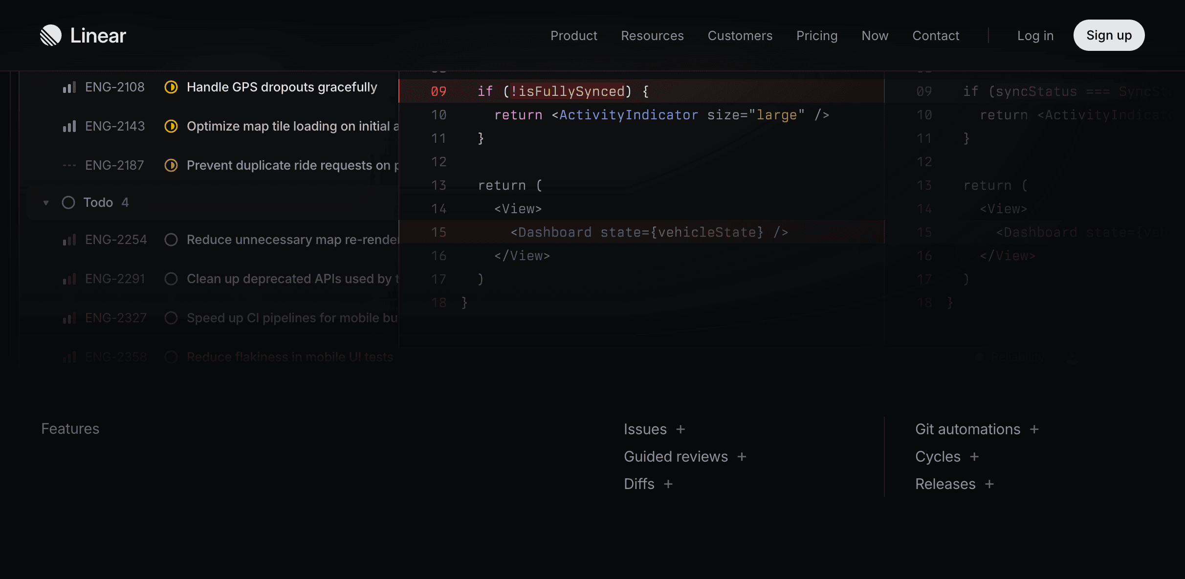
Linear
Flights look like a spreadsheet
You're ranking fares. Pretty airline logos don't help. Dense rows and quiet meta do. I stole the density from Linear's issue list.
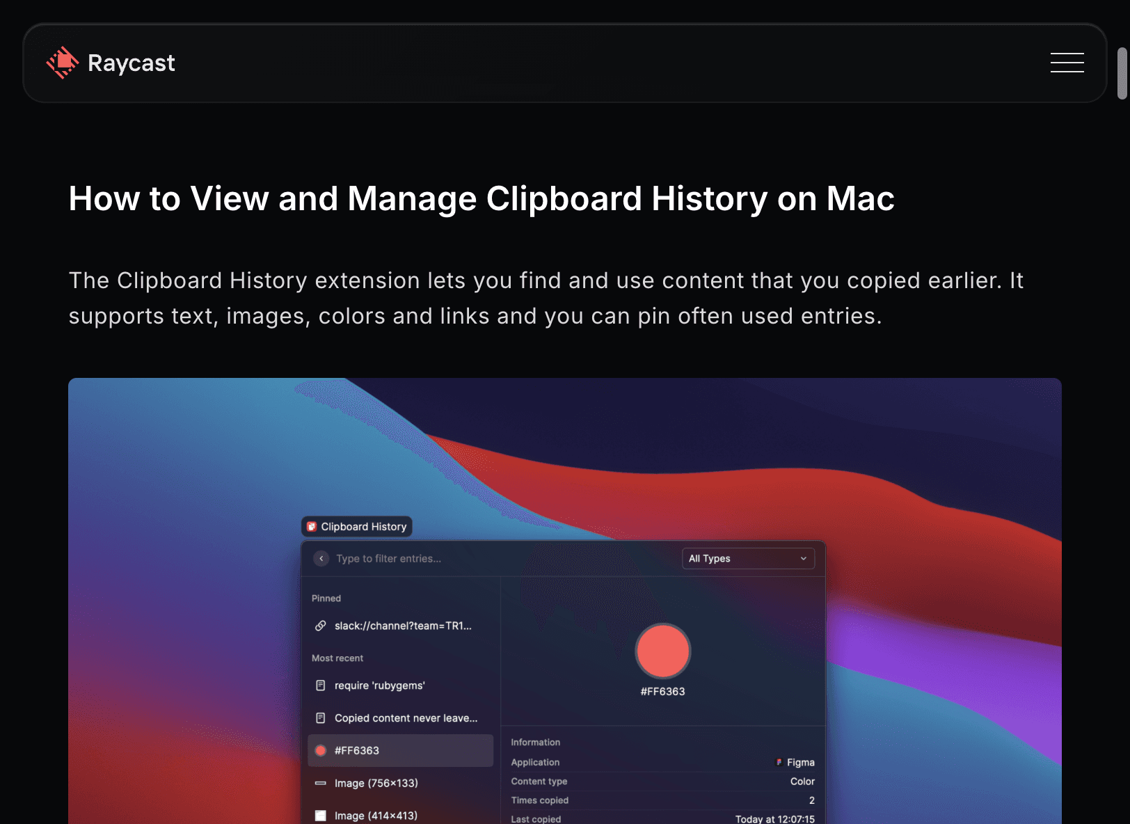
Raycast
Search shows up when you ask
A URL bar sitting there all day is mostly noise. ⌘K opens it. Esc kills it. Same idea as Raycast's compact window: useful in bursts, gone the rest of the time.
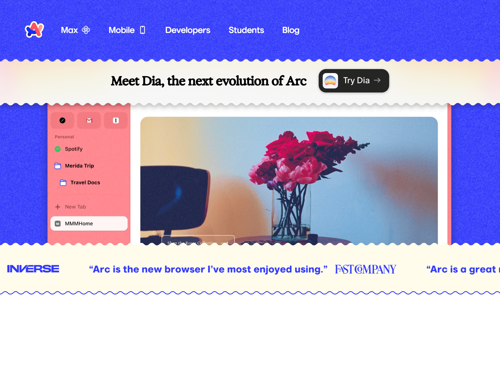
Arc
Sidebar names piles, not pages
Arc was right that top tabs turn into favicon mush. I pushed further: the rail only lists groups and how many pages are in each. Individual pages live on the desk.
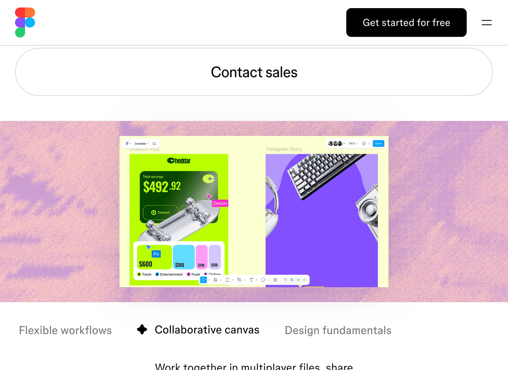
Figma + tldraw
Keep related pages in one spot
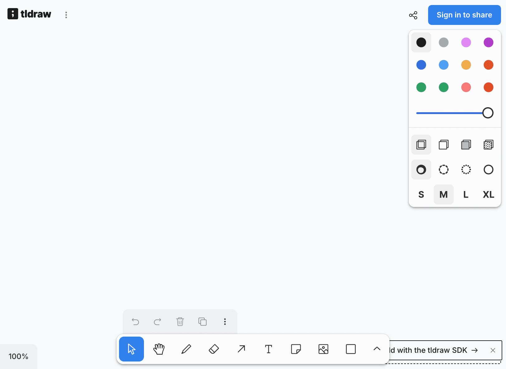
People leave tabs open so they don't lose their place. A chronological strip fights that. On a desk, a group can sit where you left it until you're done with it.
Folded map
Different jobs look different
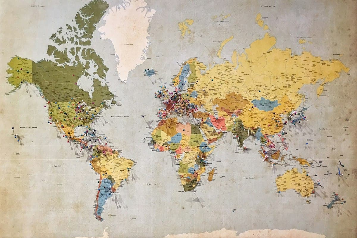
A things-to-do pile shouldn't look like airfare. Uneven tiles for browsing. Tight rows for comparing. Same desk, different shapes so you can tell them apart at a glance.
Later
If this were real
These are the gaps I'd fill to make this something I could use every day.
Pan and zoom when it gets big
This demo's field is fixed. A real desk would need to roam like Figma without losing where you were.
More than one context at a time
Work trip and personal browsing shouldn't dump onto the same board. Arc's Spaces are the obvious parallel. I'd want something like that before I'd use this daily.
Overflow that doesn't feel like a menu
The corner stack is a sketch. Bringing an old group back has to feel like grabbing a sticky note, not digging through Firefox's all-tabs list.
Deal with sites that won't iframe
Kayak, Google Flights, most hotels. They refuse embeds. Covers work for a demo. Shipping means a clear path to open the real page without looking broken.
Empty desk that doesn't lecture
The coach tour explains everything here. Live, I'd want one prompt to ask something, then silence. If you need a tutorial for browsing, you already lost.
Sync the piles, not the favicons
People keep tabs open as reminders. Sync only helps if the groups come with you. Recreating a strip of icons on every laptop is the problem again.